Pay Attention Now
[NOTE: This material does not represent investment advice in any way. It is for educational purposes only. Investing is personal. See your personal guru before making decisions.]
Bulls can live 20 years, but they aren’t much good to the herd after ten. Bull markets are probably the same. This one is ten years’ long in the tooth, but it’s weathered a number of “storms” along the way, so many investors could need to get quite scared before they sell. The scariest thing for me is the global trend toward authoritarianism; you can check a lot of boxes to compare the first part of the last century with today. I could probably list six or seven parallels. Protectionism is a big one. Wealth inequality is another. That progression didn’t end well to put it mildly.
Depending on the polls, some money might soon begin to “stay away” from the 2020 elections for fear of progressive policies that may reverse the current trend and provide welfare to the needy at the expense of the wealthy. Traditionally, it’s bad for stocks when lower-income people have more to spend (go figure).
The most noteworthy recent event –No, not the latest tariff drumbeat–was the sense that the Fed will become the “buyer of last resort.” In other words, they are poised to lower rates (or possibly even resume QE?) if the economy begins to falter. For example. on Friday the jobs number was much lower than expected, but the market rallied on the news. Why? –Because then the Fed will come to the rescue! This is the equivalent of the opioid addict happy to have been hit by a car in order to get a new prescription.
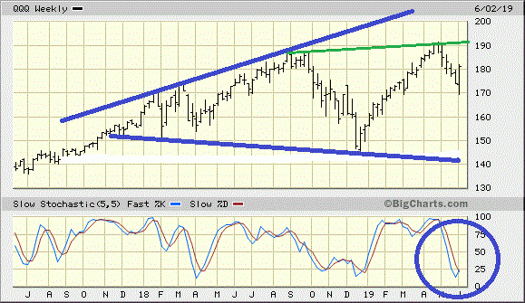
Much of the above considers the fundamental picture, but the technical picture bears watching. Here’s a chart of the QQQ, the big technology stocks. If they go, the broader market will follow. The “wedge” I drew (some call it a “megaphone”) implies that the range from high to low keeps getting wider and wider. It’s often considered an exhaustion or topping pattern. The idea is that if the market can’t get to the top of the range this time, it might test the lows again. Pay attention to the 192 level for the QQQ. If the market can break through that, it might be okay for a while. The circled area could represent a “divergence,” but it’s too soon to tell.

This next chart merely offers perspective on the broader market, the SP500 index. Note that the slope of the rise is only equaled by the period leading up to the tech crash of 2000. The percentage of the move was similar, too–about 250 percent rise from bottom to top in each case.

Despite the somewhat ominous pictures here, there’s nothing to say the market can’t keep going. My point is that this is another important juncture for the markets and if they can’t muster a new high soon, it’s not auspicious at all.
WRH

No Comment